TL;DR
- Checkout conversion rate is an ecommerce metric that measures how many shoppers complete their purchase after initiating the checkout process.
- Improving your checkout conversion rate is critical because it directly boosts revenue by turning a higher percentage of existing, ready-to-buy shoppers into paying customers.
- Checkout conversion rate is calculated by dividing the number of completed purchases by the number of initiated checkouts and multiplying by 100.
- Best practices include simplifying the process, optimizing for mobile, offering multiple payment methods, and using AI tools.
The checkout process is the most critical part of your customers’ online shopping experience, but it’s often the most overlooked. You might assume that once shoppers have added items to their carts and started checking out, they’re committed to buying, right?
Not exactly. In fact, studies show that the average cart abandonment rate is over 70%. It basically means that roughly 7 out of 10 online shoppers leave without completing their purchase. And that results in billions in lost revenue each year.
While users may abandon their shopping carts for a variety of reasons, a poorly optimized checkout process remains one of the primary drivers. In this blog, we’ve outlined the essential steps you can take to optimize the user experience (UX) and ensure higher conversions.
What is checkout conversion rate?
Checkout conversion rate is an ecommerce metric that measures how many shoppers complete their purchase after initiating the checkout process. Unlike the sales conversion rate, which measures the percentage of all website visitors who make a purchase, the checkout conversion rate focuses specifically on those who have already shown strong buying intent by starting checkout.
Factors like payment options, shipping fees, page load times, and customer effort all influence this metric. Tracking your checkout conversion rate can help you determine how effective your checkout process is at driving conversions. This is basically how you:
- Spot exactly where and why shoppers drop off during checkout
- See which checkout designs make the process smoother (or not)
- Test how different tweaks or layout changes affect your conversion rate
Understanding how many people actually make it through checkout and where friction is happening puts you in a better position to optimize the entire process, reduce cart abandonment, and increase sales.
What is the formula for checkout conversion rate?
To calculate your checkout conversion rate accurately, you need just a few key data points:
- The number of checkout sessions started (this is the count of unique sessions where shoppers begin the checkout process)
- The number of completed purchases (the number of shoppers who finish checkout and complete payment, resulting in a confirmed order)
Checkout Conversion Rate = (Number of Completed Purchases / Number of Initiated Checkouts) x 100
Let’s say 1,000 people initiated the checkout process and 700 completed the purchase. Your checkout conversion rate is (700/1000) x 100 = 70%. This means 70% of your customers who added items to their shopping carts made purchases.
Optimizing the Pre-Checkout Experience
Before a customer even reaches your checkout page, their experience on your site determines whether they’ll convert. A seamless pre-checkout journey builds trust and momentum.
- Clear information hierarchy: Shoppers should immediately understand where to go. Headlines, CTAs, and product categories must guide users seamlessly from curiosity to cart.
- Consistent and intuitive navigation: Your navigation should feel invisible. Multi-level menus, breadcrumbs, and "3 clicks to product" rules help shoppers find what they need without thinking twice.
- Responsive, mobile-first design: With over 70% of ecommerce sales now happening on mobile, your site must be fully accessible and adaptable to every device.
5 Ways to optimize checkout conversion rate and increase sales
1. Simplify your checkout process
Your number one goal should be to make the checkout process as intuitive and user-friendly as possible for your customers. Any point of confusion or unnecessary step in the checkout flow can create friction and lead to cart abandonment. To create a truly frictionless experience, eliminate anything that makes customers pause or question what they need to do next. Here are some steps you can take:
- Remove unnecessary fields: Ask only for the essentials, like shipping and payment details. Every extra field adds friction and mental effort, increasing the chances that shoppers will abandon their carts.
- Offer a guest checkout option: For first-time shoppers, being forced to create an account can be a major turnoff. Let them complete their purchase as guests, then invite them to create an account after they’ve completed their purchase.
- Auto-populate and suggest: Let shoppers use auto-complete for their shipping and payment details and give them the option to save that info for next time. This reduces typing and makes it quicker and easier to complete their purchase.
- Avoid elements that can cause distractions: This can include promotional pop-ups (unless these are personalized AI-powered product recommendations), navigation links that lead away from the checkout, or other unnecessary visual clutter.
2. Make the checkout process as fast as possible
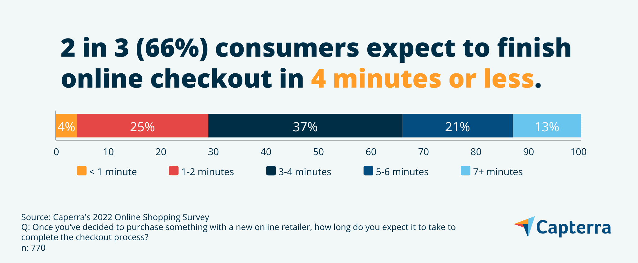
When it comes to online checkout, speed is everything – even a slight delay can cost you conversions. In fact, research shows that one extra second in page load time can cost you 7% in conversions. Additionally, 66% of online shoppers expect to complete online checkout in 4 minutes or less. A few steps to consider:
- Minimize redirects: Every redirect adds extra load time, slowing down the checkout process. Keep customers on the same page as much as possible to reduce latency and prevent drop-offs.
- Optimize your load times: Compress images, minify CSS and JavaScript files, and eliminate unnecessary code to improve page speed.
- Enable browser caching: Store frequently used resources like logos and icons in customers’ browsers, so they don’t have to be reloaded on every page.
A slow checkout page can be just as frustrating as a complicated one, so make sure your pages load quickly on both desktop and mobile.

3. Offer multiple payment methods
Checkout abandonment often spikes at the final stage because merchants fail to offer enough payment options. Statistically, 56% of shoppers expect a variety of payment options on the checkout page.
Providing flexible payment methods can greatly improve conversion rates and appeal to a wider range of customer preferences:
- Accept all major credit cards, such as Visa, Mastercard, American Express, and Discover.
- Accept digital wallets like Apple Pay, Google Pay, PayPal, and Amazon Pay.
- Offer a buy now, pay later (BNPL) option by integrating services like Klarna or Affirm. BNPL can increase conversions and boost average order values for merchants by 20–40%.
4. Add an AI chatbot to your checkout page
Adding an AI chatbot widget to your checkout page can also help improve your checkout conversion rate. Ecommerce chatbots can cut cart abandonment by 20-30% by providing:
- Immediate support: When shoppers get stuck on shipping fees or encounter payment errors, an AI chatbot can offer instant assistance.
- Proactive recovery: AI chatbots can be set to send proactive messages (like “Need help completing your purchase?”) when shoppers stay idle.
- Personalized recommendations: Suggest items that pair perfectly with what shoppers already have in their cart.
5. Test and optimize continuously
The work doesn’t stop once you’ve implemented a solid checkout process. Regularly testing and refining your ecommerce checkout is essential. Even a minor adjustment (like changing the placement of a button) can have a significant impact.
- Use A/B testing: Experiment with different versions of your checkout page (button colors, layout) to identify what works best.
- Collect customer feedback: Use exit surveys to understand why your customers abandon carts.
- Analyze checkout data: Use analytics tools to monitor where customers are dropping off. Are they leaving at the payment stage?
Optimize your checkout conversion rate with Maropost Commerce Cloud
While optimizing the checkout experience is only one step in improving your online store performance, it’s an important one. With Maropost Commerce Cloud, you can increase your checkout conversion rate by making the process quick, effortless, and intuitive.
On top of that, Maropost Commerce Cloud offers all the tools you need to manage your entire ecommerce engine effectively – from storefronts and product catalogs to inventory, pricing, and orders.
Book a demo now to see Maropost Commerce Cloud in action.
Frequently asked questions
What is a good checkout conversion rate in ecommerce?
The average checkout conversion rate varies depending on the industry, but the typical range for most ecommerce stores is between 65%-85%. If your checkout conversion rate is below 60%, it might indicate serious friction points in your checkout process.
What's the difference between checkout conversion rate and sales conversion rate?
Sales conversion rate is the percentage of all website visitors who complete a purchase. Checkout conversion rate is the percentage of shoppers who start the checkout process and successfully complete a purchase. It isolates your checkout performance specifically.
Why should I care about my checkout conversion rate?
You should care because it directly impacts your revenue. A higher checkout conversion rate means more sales from your existing website traffic. Considering that nearly 70% of shopping carts get abandoned, every percentage point you gain in checkout conversion directly recovers lost sales.
What are key performance indicators in ecommerce?
Key essential ecommerce metrics that you should be tracking include:
- Sales conversion rate: The percentage of your website visitors who make a purchase.
- Cart abandonment rate: The percentage of shoppers who leave without purchasing.
- Bounce rate: The percentage of visitors who leave without any action.
- Average order value: The amount a customer typically spends in a single purchase.
- Customer lifetime value: The total revenue a customer generates throughout their entire journey.
- Repeat purchase rate: The percentage of customers who make more than one purchase.

